
KitchenAid Pro Line Countertop Appliances
The KitchenAid stand mixer is a design icon. Its cast metal components and robust mechanicals have made it an heirloom-quality product for generations of families. The Pro Line series was envisioned as a halo suite of products that would deliver on the promise of quality established by the stand mixer. I managed the development program, and personally designed several of the products. The KitchenAid Pro Line suite represents the "best-of-breed" in terms of performance, quality, materials and design.
KitchenAid Pro Line Visual Brand Language
Before starting to design the first new Pro Line appliance, we developed a flexible VBL (Visual Brand Language) spanning our entire countertop portfolio. The goal of this activity was to ensure design consistency regardless of the individual product type.
KitchenAid Portables Visual Brand Language document - Whirlpool Global Consumer Design + Ziba Design
Objective
Develop a flexible and scalable visual brand language for the proposed Pro Line series of countertop appliances. The document is intended to ensure that design intent is maintained across multiple products (core design tenets and details) and across OEM suppliers (specific to craftsmanship and perceived quality).
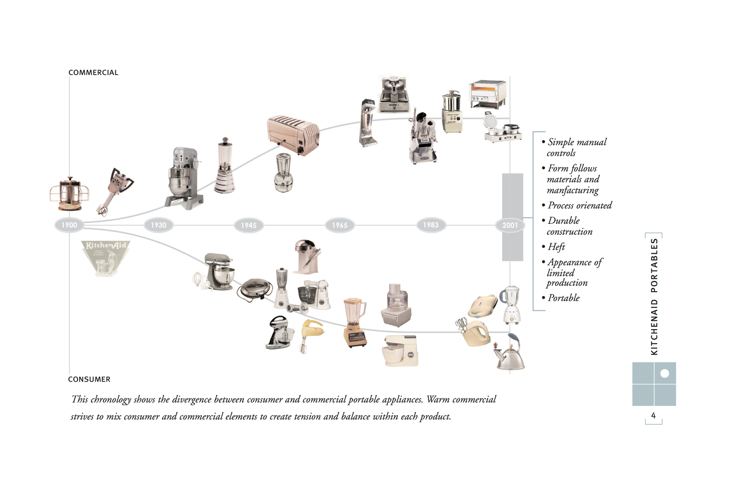
Process
Our team started the Pro Line design process with three very powerful tools: A clean sheet of paper, a rich brand heritage and the support of Ziba Design. We didn't want to simply apply the Stand Mixer's design elements to our new appliance suite - we wanted to appropriately reference the essence of the Stand Mixer and express that in every new product we developed. To do that, we first had to understand what users believed to be the Stand Mixer's most important attributes.
Once we were certain that we understood the attributes that make the Stand Mixer so special, we created a document that illustrated those attributes as design language elements. The appropriate aesthetic fell between commercial and residential appliances - we dubbed the new language "Warm Commercial". Our library of design language elements contained the "hard points" around which we could design and build new products.

KitchenAid Portables Visual Brand Language document - Whirlpool Global Consumer Design + Ziba Design

Color Material & Finish
Color is as much a design language element as form, and at KitchenAid we spent a tremendous amount of time watching, predicting and projecting trends - building color palettes and investigating new finish options. Because we worked so closely with our key retailers, they often asked us to develop special limited edition SKUs and collections solely for their stores. By creating these limited series, we were able to test new CMF solutions on a small scale with lower investment and risk.

KitchenAid Color, Finish & Material documentation

Result
This was the most comprehensive VBL development effort I had seen to date. It was detailed, thoughtful and highly usable (primarily by our design team). The resulting products developed using the VBL guidelines are very consistent, and yet have their own individual identity. Our design team never perceived the guidelines as too restrictive, but rather relied on them to understand how much attitude they had to create differentiation between individual products.
My role: Creative Direction / Team Leadership
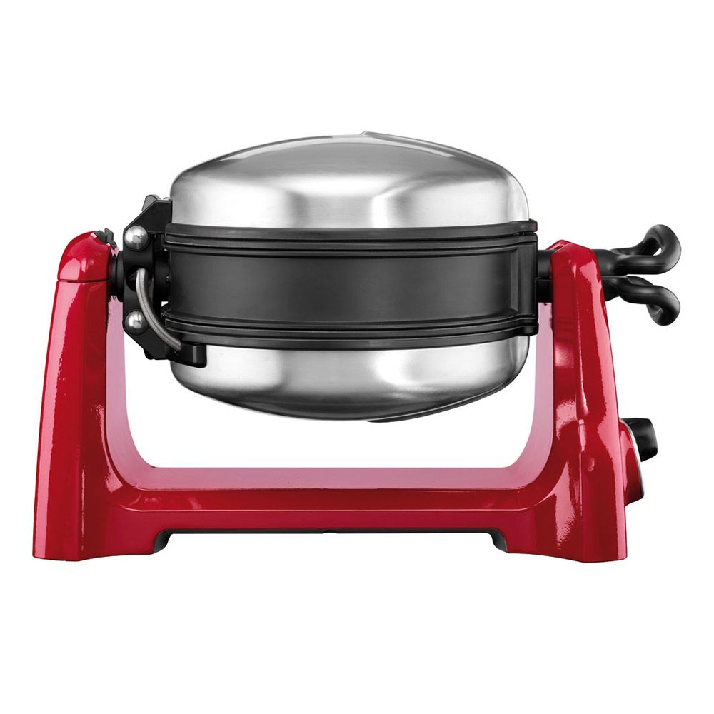
KitchenAid Pro Line Waffle Baker
The Pro Line Waffle Baker was envisioned as an equal to the stand mixer in terms of perceived quality and appeal as a family heirloom. Our team started the design process by observing users preparing and serving waffles (primarily to their families). We found that most consumer waffle bakers didn't meet users' expectations in terms of results, performance, durability and cleanability.
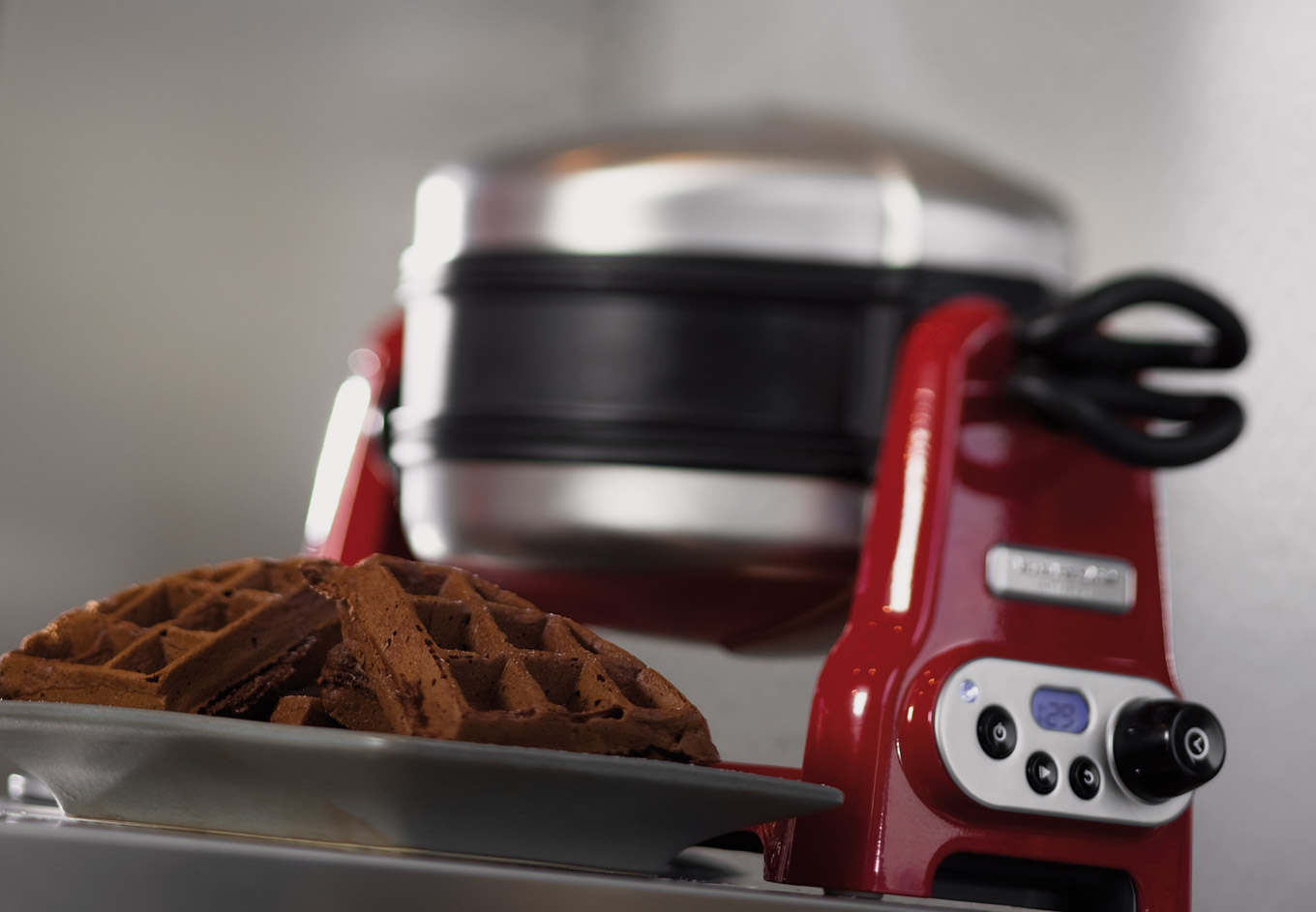
KitchenAid Pro Line Waffle Baker in Empire Red
Process
We based our design on commercial restaurant-style waffle bakers, which are built for years and years of use and abuse. These commercial products rotate in order to allow the batter to fill every nook and cranny of the cooking surface. This also allows the waffle to bake much faster than in a non-rotating waffle baker. The other benefit of this design is that you can bake two waffles at the same time. The notion of using a commercial architecture for a residential product seems pretty straightforward, but it was an innovation in this particular category.

My team’s role: We were responsible for the up-front formative research, VBL (Visual Brand Language) development, Industrial Design, UI/HMI design, usability testing, ergonomic development/testing and vendor liaising.
My role: Design Lead / Team Leadership
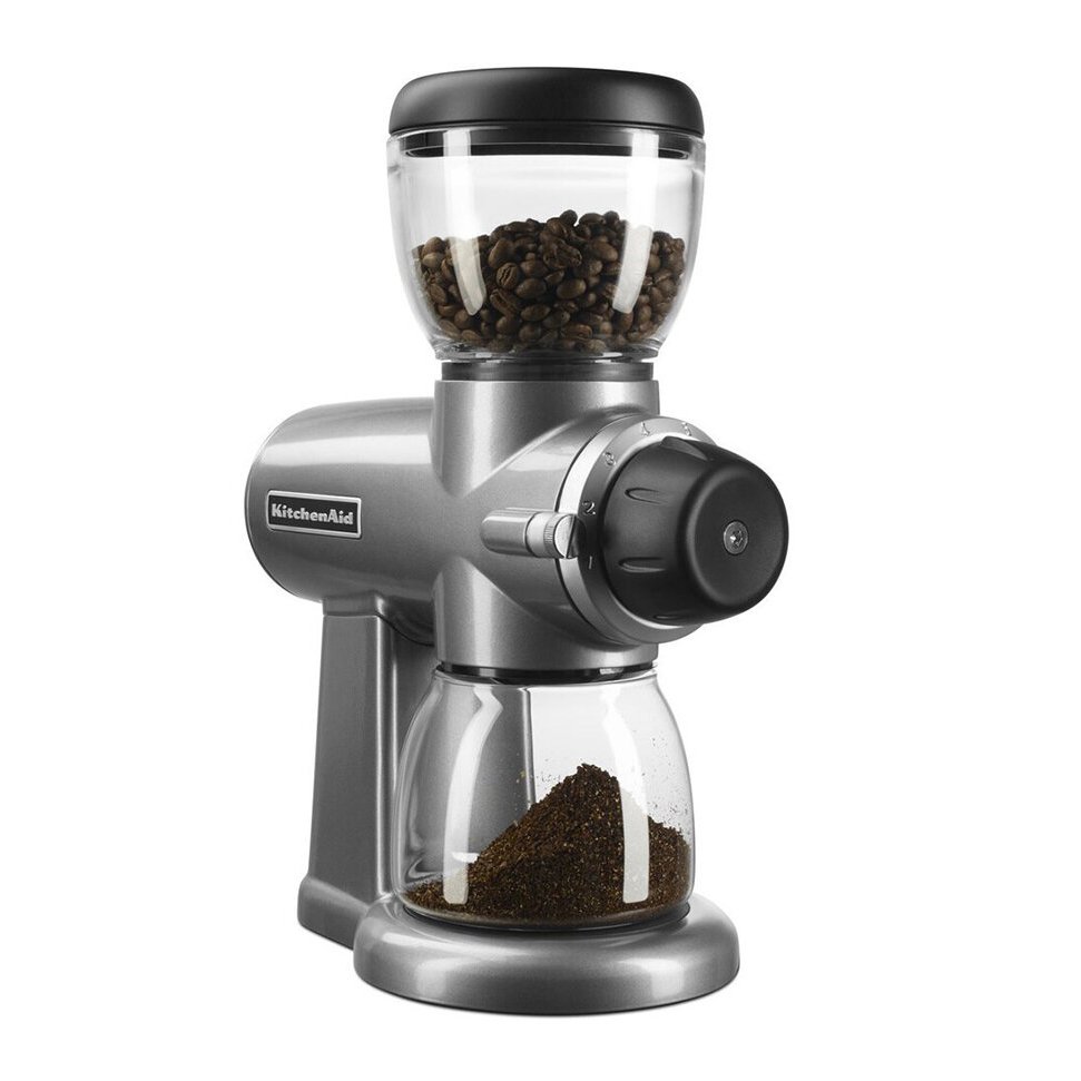
KitchenAid Pro Line Burr Grinder
While the Pro Line Burr Grinder clearly takes inspiration from the KitchenAid Stand Mixer, it was critical that it also incorporate DNA from KitchenAid's new countertop Espresso Machine (with which it would often be paired). Another interesting twist to the program was the fact that KitchenAid's distributor in Europe is Alessi. As Europe was a primary market for this product, I used several of Alessi's more whimsical designs as inspiration, in combination with traditional KitchenAid heritage design elements.
The Pro Line Grinder and Espresso Machine were designed in parallel in order to create a residential countertop coffee suite.
Early Concept Sketch - John Ledingham, Whirlpool Global Consumer Design
Photoshop Concept Rendering - John Ledingham, Whirlpool Global Consumer Design
Tangerine
Empire Red
Onyx Black
My team’s role: We were responsible for the up-front formative research, VBL (Visual Brand Language) development, Industrial Design, UI/HMI design, usability testing, and ergonomic development and testing.
My role: Design Lead / Team Leadership
KitchenAid Pro Line Espresso Machine
For Pro Line, the team chose a “best-of-breed” manufacturing approach - selecting OEM suppliers which were proven leaders in their respective categories. The Espresso Machine required a partner with a proven track record, and a legacy of quality. We chose to work with Gaggia, in Milano, Italy. We relied heavily on Gaggia’s technical knowledge, as well as their deep understanding of the discerning coffee aficionado. The result is a machine that performs like a commercial product and, when used by someone with the passion and patience to become proficient, delivers results equal to those created by a professional barista…honestly.
KitchenAid Pro Line Espresso Machine in Empire Red, Michael Seum, Whirlpool Global Consumer Design
Process
The biggest challenge we faced, across the Pro Line portfolio, was the requirement that all of the products look and feel like they came down the same assembly line. That was no small feat. As an example, the Espresso Machine and Burr Grinder would frequently be purchased together. While the Espresso Machine was built in Italy, the Burr Grinder was built in China by a company specializing in high-end countertop electrics. It was our job to make sure that they felt like a family. My team and I spent countless hours on the ground, collaborating directly with the suppliers to ensure that our design intent and brand attributes were maintained across many multiple products and manufacturing sites.
My team’s role: We were responsible for the up-front formative research, VBL (Visual Brand Language) development, Industrial Design, UI/HMI design, usability testing, ergonomic development/testing and vendor liaising.
My role: Creative Direction / Team Leadership
KitchenAid Pro Line Coffee Maker
The KitchenAid Pro Line Coffee Maker brings restaurant quality materials and performance into the residential kitchen. Built with stainless steel and die cast sink, the coffee maker is intended to last for years and years.
Process
The target competitor for the Pro Line Coffee Maker was Bunn. At the time, Bunn owned the premium commercial drip coffee maker market (quickly expanding into the consumer space) and KitchenAid wanted to unseat them as the customer’s first choice. There was no secret to brewing a great cup of coffee, so the team had to find other compelling product attributes that would cause a consumer choose KitchenAid.
After many hours spent talking with existing customers of high-end coffee makers, we decided that product quality and craftsmanship (better materials, longer life, better fit and finish) would be KitchenAid’s advantage. Where most coffee makers are made of plastic or sheet metal, the Pro Line Coffee Maker is made almost entirely of die-cast zinc. It's built like a tank, and that's what most KitchenAid customers are looking for…and it makes an excellent cup of coffee!
Early concept sketches/surface model - John Ledingham, Whirlpool Global Consumer Design
Appearance models for consumer research - John Ledingham, Whirlpool Global Consumer Design
My team’s role: We were responsible for the up-front formative research, VBL (Visual Brand Language) development, Industrial Design, UI/HMI design, usability testing, ergonomic development/testing and vendor liaising.
My role: Design Lead / Team Leadership
KitchenAid Pro Line Toaster
While its design is unmistakably KitchenAid, the Pro Line toaster borrows its basic mechanical design from commercial toasters, like the UK's classic Dualit. The platformed design approach, using two die-cast end-caps and a stainless steel wrap, allows for both 2-slice and 4-slice models built utilizing largely the same parts bin. The Pro Line Toaster has become very iconic, and is often seen in movies and on television due in part to the timeless nature of its design.
KitchenAid Two-slice Pro Line Toaster in Tangerine, Michael Seum, Whirlpool Global Consumer Design
My team’s role: We were responsible for the up-front formative research, VBL (Visual Brand Language) development, Industrial Design, UI/HMI design, usability testing, ergonomic development/testing and vendor liaising.
My role: Creative Direction / Team Leadership
KitchenAid Pro Line Ice Cream Maker
Our team collaborated with SaniServ, the nation's leading ice cream machine manufacturer, to reimagine the ice cream making experience at home. In talking to users, we found that they loved the idea of mixing their own ingredients to create personalized family recipes, but they didn't like the fact that there was so much variation between different batches of ice cream. Our design solved this by utilizing commercial-grade components (ingredient feeders, augers, etc.) to deliver a consistent outcome, allowing users to focus on the fun part - coming-up with new recipes that they could share with friends and family.

My team’s role: We were responsible for the up-front formative research, VBL (Visual Brand Language) development, Industrial Design, UI/HMI design, usability testing, ergonomic development/testing and vendor liaising.
My role: Design Lead / Team Leadership